

Ovarian Cancer Research Foundation | Brand Refresh
A bold new identity for a movement determined to change women’s futures.
Overview
Ovarian Cancer Research Foundation (OCRF) partnered with Marlin to deliver a comprehensive brand refresh that would mark an important moment in the organisation’s history and ambition.
As Australia’s leading independent funder of ovarian cancer research, OCRF plays a critical role in changing outcomes for one of the most lethal women’s cancers. Approaching its 25th anniversary, the organisation recognised the need for a brand that could better express its activist voice, scientific credibility and unwavering determination to change the statistics for women and girls.
Working closely together, we developed a new visual and verbal identity that reflects OCRF’s purpose, momentum and optimism. The refreshed brand is designed to unite supporters, researchers and communities around a shared belief that the futures of women can and must be changed.
Problem
Reimagine OCRF’s brand to reflect its activist voice, scientific leadership and ambition to change outcomes for women with ovarian cancer.
Solution
A flexible new brand identity that balances scientific credibility with optimism, humanity and momentum, supporting OCRF’s growth and fundraising ambitions.
Results
A confident new brand that strengthens advocacy, engagement and belief in OCRF’s mission to change the futures of women and girls.
“This new brand emerged from extensive consultation and fantastic creative from the team at Marlin Communications. The result is an exciting and important step as we kick off OCRF’s 25th anniversary year.”
Avalee Weir, Senior Communications DirectorOvarian Cancer Research Foundation
The Challenge
OCRF operates in a complex and emotionally charged space. While supporters trust the organisation deeply and believe in research-led solutions, ovarian cancer remains underfunded, under-recognised and often feared.
The existing brand no longer fully reflected OCRF’s evolving strategy or its growing role as an advocate for change. It needed to feel more confident, more flexible and more expressive, while remaining grounded in science and lived experience.
The challenge was to create a brand system that could carry a health activist tone without losing credibility, support fundraising across diverse channels, and resonate equally with donors, fundraisers, researchers and women impacted by the disease. This work also needed to honour OCRF’s legacy while signalling a new era during its 25th anniversary year.
The Solution
The refreshed OCRF brand identity centres on the letter and shape of an imperfect, organic ‘O’, referencing cells, eggs and ovaries while expressing optimism and forward momentum.
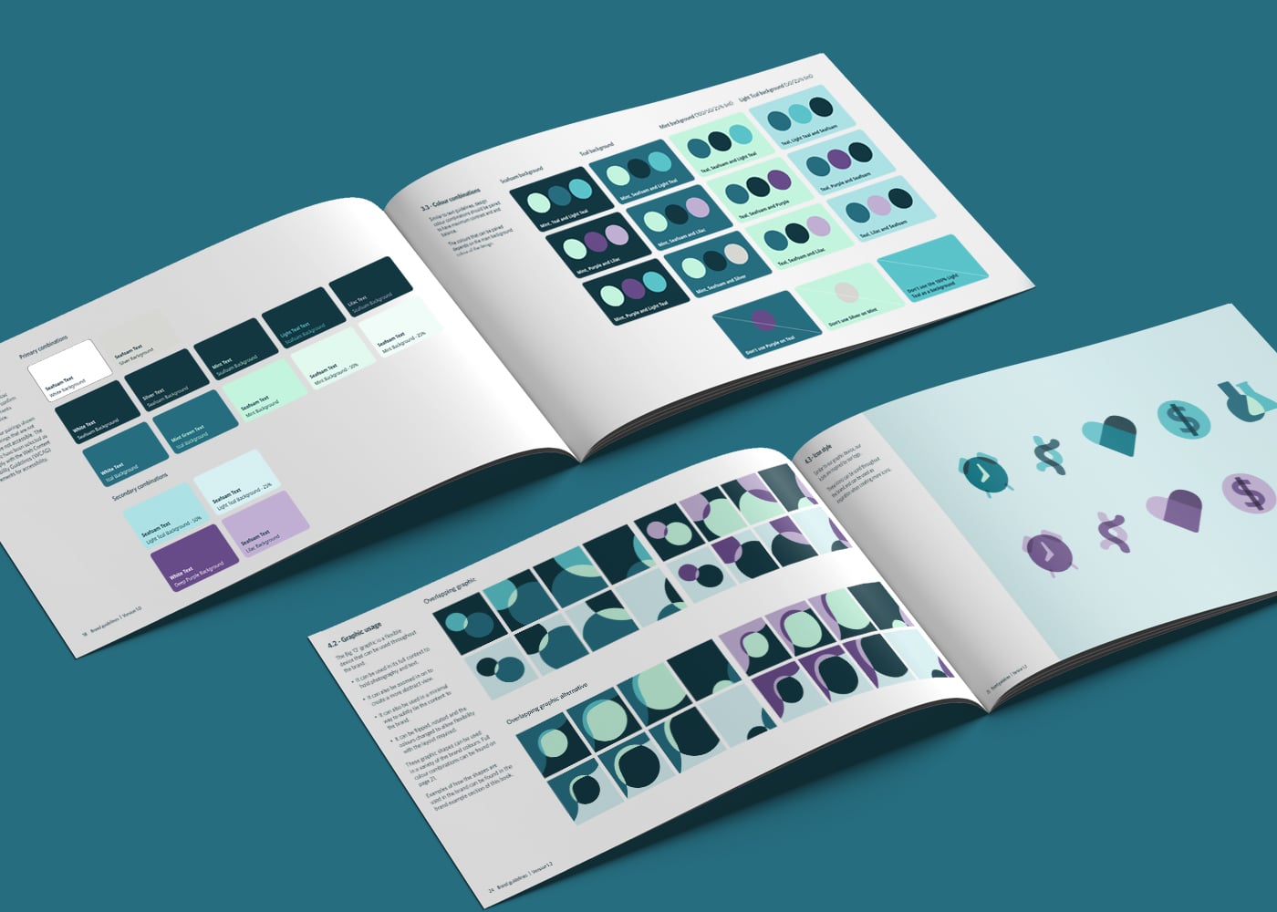
Layered, connected forms create a visual language that feels human and hopeful, balanced with a clean, confident typeface that reinforces scientific credibility. The updated colour palette builds on OCRF’s established teal and introduces complementary tones to signal renewal, resilience and growth.
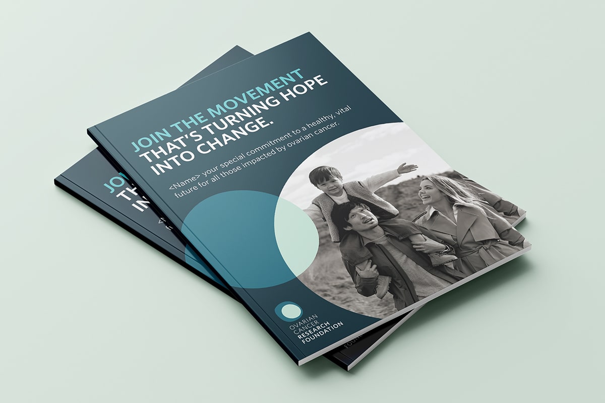
Marlin led the brand development from early logo exploration through to a refined, flexible identity system, including anniversary lock-ups and key applications. A refreshed brand book brings the visual and verbal identity together, equipping OCRF teams with a clear, practical framework to support fundraising, storytelling and engagement into the future.

The Results
The refreshed OCRF brand provides a strong and expressive platform for the organisation’s next chapter. It clearly signals momentum, ambition and belief in change, while remaining deeply rooted in research, trust and lived experience.
Internally, teams now have a shared language and visual system that supports consistency, confidence and creativity across campaigns. Externally, the brand strengthens recognition, emotional connection and engagement, helping supporters see themselves as part of a movement determined to rewrite the future for women with ovarian cancer.