Website scoping and development
Leukaemia Foundation
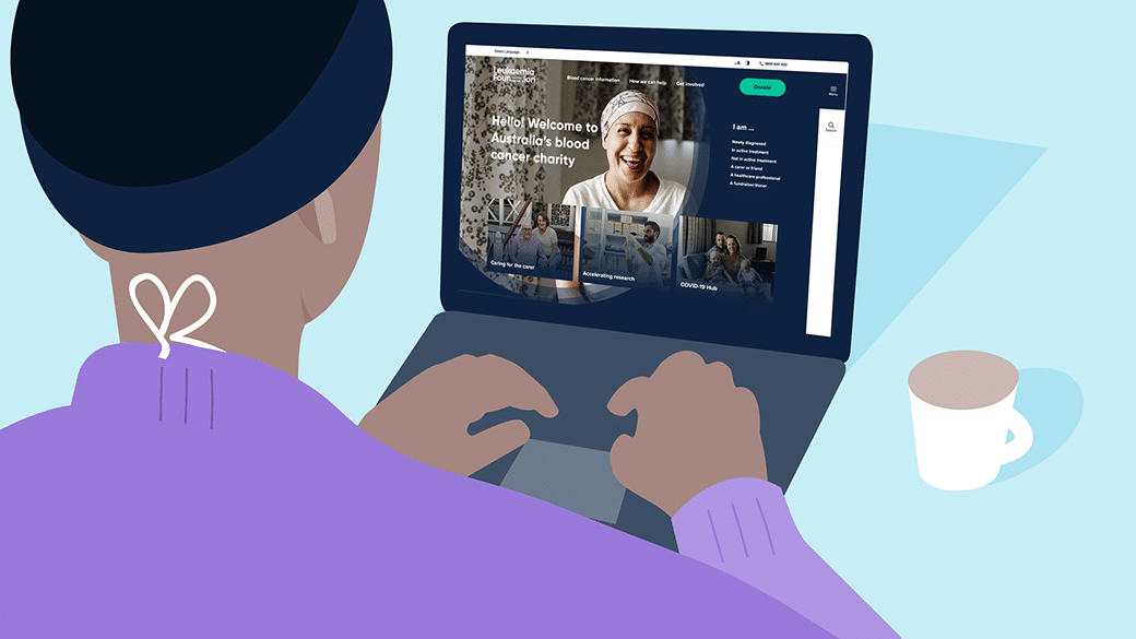
The Leukaemia Foundation of Australia and the Leukaemia Foundation of Queensland merged their respective websites in April 2018, as part of the unification of the two organisations.
With a new organisation has come a new structure, new service offerings, and new goals. The Leukaemia Foundation’s new stakeholder-centric approach and reframing innovation is resulting in new programs, products, tools and service delivery methods. In addition, the current Leukaemia Foundation website has not had any significant updates since 2014.
We started with a website strategy engagement to understand where the key opportunities lie in the refresh and what key stakeholders would need to be involved. We then engaged in the process of website redesign and redevelopment, including an update to their eCommerce store.
Problem
With the merge of The Leukaemia Foundation of Australia and the Leukaemia Foundation of Queensland comes a new structure, new service offerings, and new goals.
Solution
We started with a website strategy engagement to understand where the key opportunities lie in the refresh of the old website.
Results
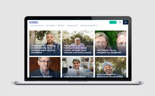
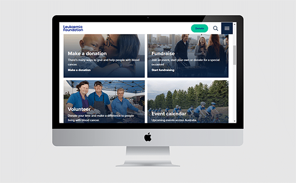
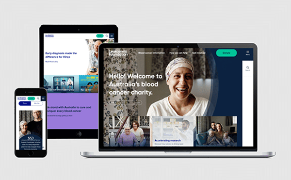
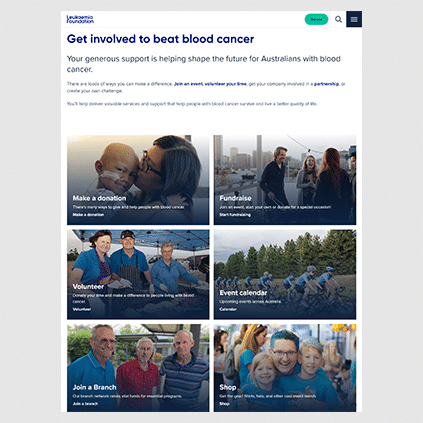
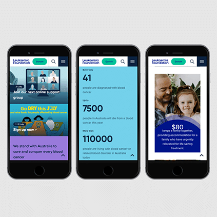
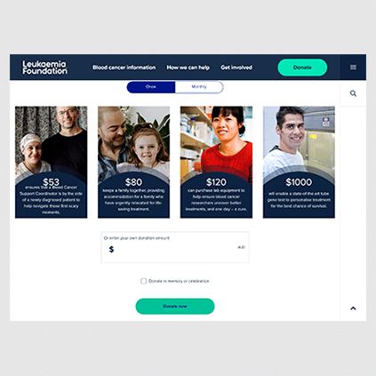
We redesigned the website making sure it met the requirements of the stakeholders and real LF families and donors. The other really important component was improving the payments and CRM integrations.
“From the beginning of the project, the Leafcutter team showed a clear understanding of our business requirements and shared our desire to deliver a valuable, seamless website experience to all of our different stakeholders”
Ally Tutkaluk, Digital Marketing SpecialistLeukaemia Foundation
The Challenge
The Leukaemia Foundation had changed significantly since the original development of the website. With the site being 5 years old and having limited capacity for change and updates, the Leukaemia Foundation identified that they wanted something new and best practice that could cater for the needs of their supporters, researchers and families.
The first question to answer as part of the redevelopment was where to start. We reviewed all the data, including analytics, surveys and strategy documents provided by LF to determine where to focus and which opportunities to pursue.
From these reviews, we identified a range of different actions and stakeholders, but the primary one being the need to provide support quickly to those seeking support, funneling them into the best part of the organisation that is suitable for them.
The Solution
The most important aspect of the redesign was making the information simple and easy to access. We conducted a number of user interviews to get a better understanding of the emotions and needs of the people LF are supporting and how their needs could look online.
Before we went into build, we made sure to test the designs we produced against real LF families and donors, to make sure we were getting the experience right and we were focusing on the right things. This initial user testing suggested we were on the right track, and with a few tweaks we were able to answer some of the more challenging user cases that were previously in play.
The other really important component was improving the payments and CRM integrations. With the previous site, there were issues with payments and lack of data sharing, and with a lot of work we were able to identify these issues and solve them. We also implemented more extensive eCommerce and conversion tracking so LF can monitor the success of the website and improve it going forward.
Wrapping up
Not sure where to start with your website? Before investing in a new website, it’s important to understand your stakeholders’ and how the investment will meet those needs. Talk to us for a website discovery session before starting your website project!

