How to ensure your website is optimised for fundraising in 2021
— by James Hornitzky
In 2020 we watched as the world moved online more than ever before, and this is only set to continue in 2021 and beyond.
Now users are spending more time online, they expect their user experience to be a great one and charity websites are no exception.
Despite this, web development technology remains largely unchanged. Charities must think practically about the steps they can take to meet expectations.
Below are our top three best practice approaches to ensure a great digital experience for your supporters.
- A great user experience to improve conversion
A website user will not be prompted into action if a donation page has no imagery (or small images) and lack of a visual hierarchy.
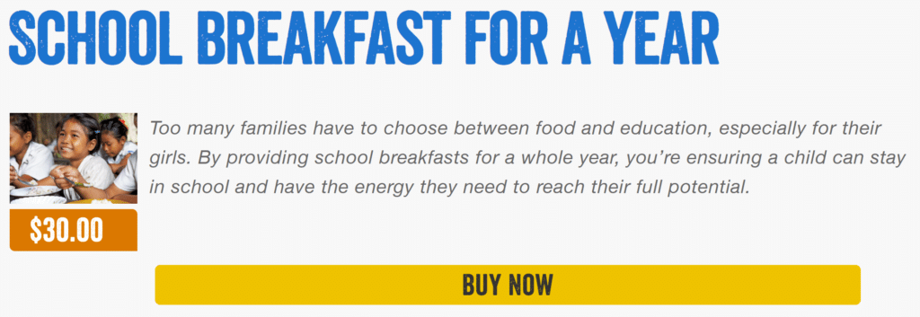
Here is an example of Plan International Australia’s online shop prior to updating last year:

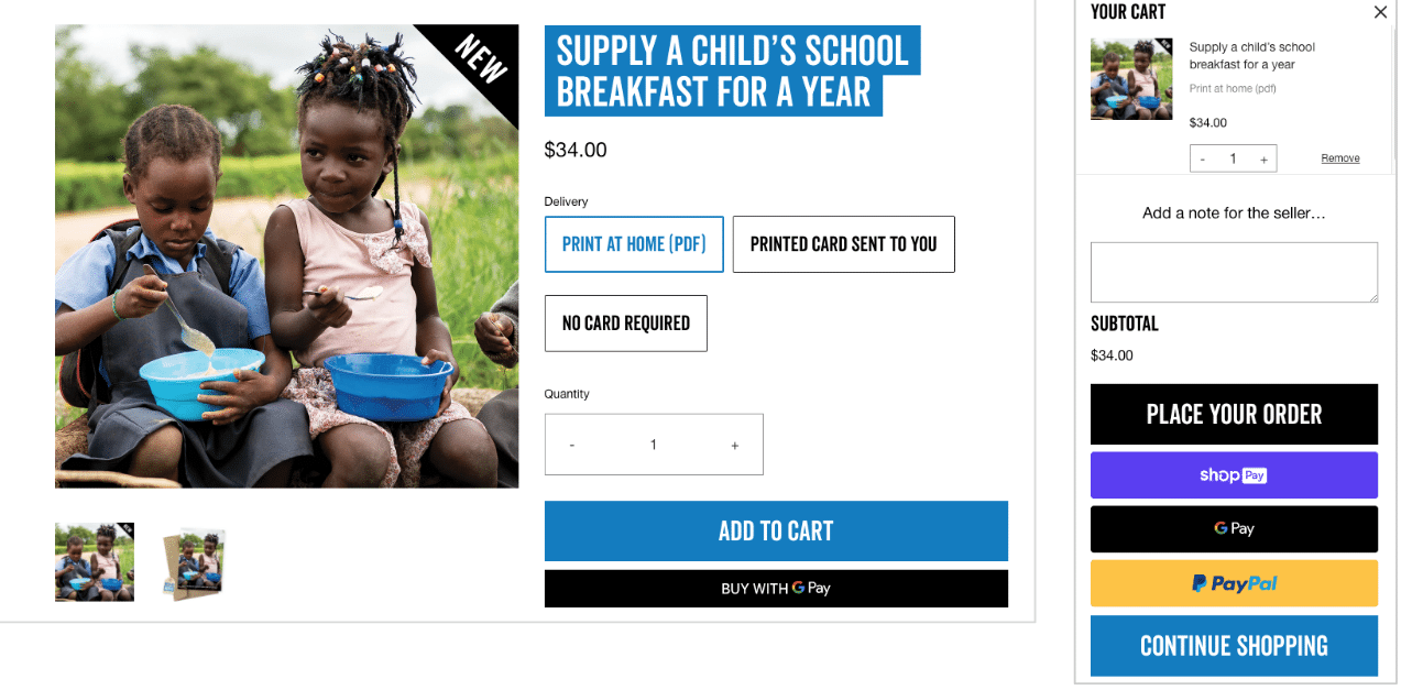
By updating the layout and providing differentiation to the design, Plan International Australia went on to achieve 131%+ increase in YoY sales in the 2020 Xmas period. The buttons now standout, there is more imagery and overall the product page feels less cluttered.

Your user experience is also what makes you stand out, so it’s essential that your promise and the value you offer are front and centre on your website. This is what will differentiate you in the marketplace.
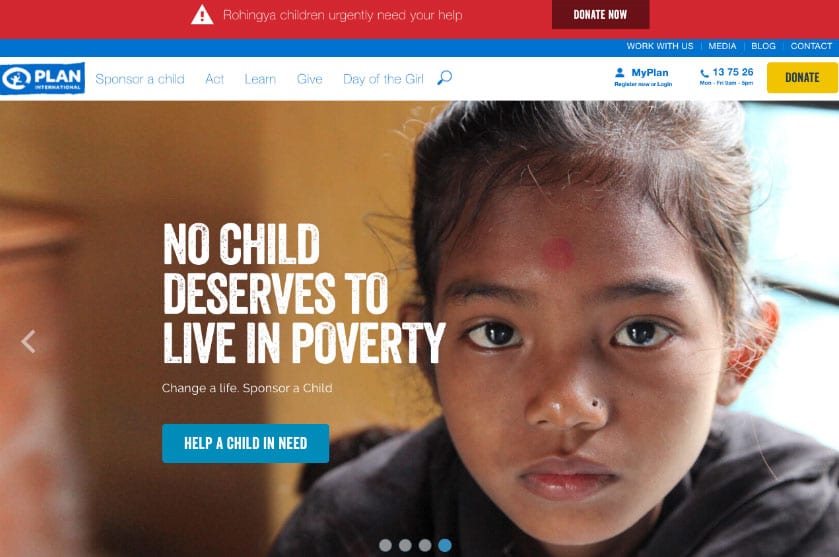
Here is the old Plan International Australia’s homepage first fold which presents a child protection charity:

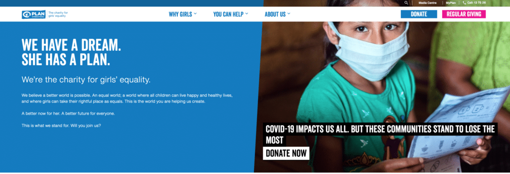
Here is the new one, clearly demonstrating Plan International Australia’s unique positioning: the charity for girls’ equality.

By focusing on your unique brand positioning you provide supporters the opportunity to quickly understand and connect with your mission.
- The ability to do things fast helps you raise more
We cannot stress the importance of being in the market at the right time. As charities often operate in rapidly changing environments this requires a fast online response.
The best way to facilitate this response is to ensure your team has the capacity to self-manage your website platform. Self management is possible by selecting a platform provider that is reliable and easy to use.
RSPCA NSW is a great example. They use the same platform to run all primary and shoulder appeals (and some unique animal emergency fundraisers too). This means that in January 2020 they swiftly got their bushfire appeal up online and raised approx 500k per day across a week.
- Staying safe keeps you online
As online traffic has increased it is no surprise that the incidence of cyber security attacks has also increased.
Without the right security measures, no website is safe. For example, WHO had their website hacked in 2020 and as a result 450 active WHO email addresses and passwords were leaked. The scammers then used these details to direct targets to a fake COVID-19 Solidary Response Fund. Incidents like this lead to devastating data, donor and organisational reputation loss.
And whilst the types of threats are very broad, there are a couple of easy steps you can take to help ensure your website’s security.
- The first step is to make sure your website is up-to-date – not only does this ensure you have the latest features, but it also gives you the latest patches and protection.
- Many attacks you will encounter are automated, so the second step is ensuring you have a firewall that will block the majority of automated attacks – Cloudflare is a good option.
If you would like to learn more about how to make sure your website isn’t letting your fundraising down, we’d be happy to do a review of your existing platform. Please get in touch.
Thank you for changing the world.
We’re here to help.
P.S. Marlin offers its own Web Platform that clients such as Plan International Australia and RSPCA NSW use to ensure their websites are stable, tested and well supported. Our platform solution offers best practice UX and out of the box page templates, donation forms and lead capture forms. You can also look to extend key features. Chat to the team to find out more.

