4 A/B Tests to Improve Your Nonprofit Value Proposition
— Written by Travis Koch with an intro from Marlin.
Whether you’re trying to raise more money online, communicate with donors face-to-face, or increase revenue from a direct mail appeal — your value proposition is the most valuable tool to influence someone to give to you. Most nonprofits, however, fall short when it comes to articulating their value proposition. Our exclusive Agency Partners, and digital fundraising experts at NextAfter have done the research and uncovered four A/B tests that to help improve your nonprofit’s value proposition. You can find the original article published here.
How effectively does your nonprofit express its value to prospective donors?
This question can often get lost in the shuffle as you focus on growing your prospect pool, increasing your communications, and marketing your brand. But each of those focuses can gain your organisation more donors by communicating a strong value proposition. In fact, every ad, email, and landing page you produce presents this vital opportunity.
You may only get one chance to convince someone to click an ad or make a donation. How do you make these moments count? Through value proposition!
We’ll take you through four A/B tests that will help improve your nonprofit value proposition and that your organisation can easily mimic. Each A/B test highlights one of the four key elements you can also use to improve your value proposition and increase giving.
A/B Test #1: Adding Value Proposition Copy to a Page
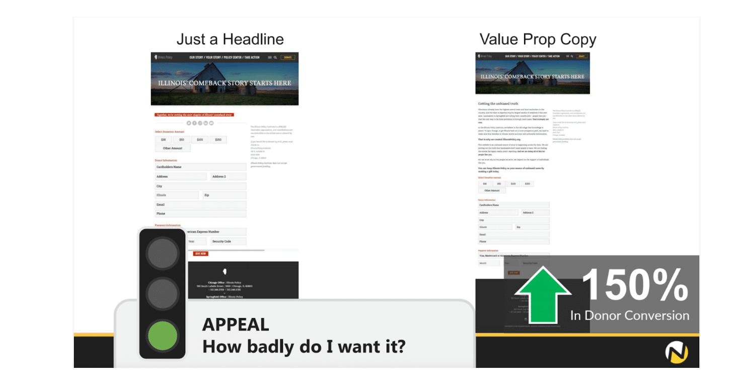
The experiment you see below tested a donation ask without value proposition copy against a donation ask with value proposition copy. Each page is identical aside from this primary difference. As you can see, simply adding value proposition copy to the donation page resulted in a 150% increase in donor conversion.

Put yourself in the shoes of a potential donor as they visit this page…
Remember, your potential donors are thinking, “How badly do I want it?” Or, in this case, “How badly do I want to give?”
I think you’d agree that reading multiple paragraphs of value proposition copy makes donating more appealing compared to reading just a headline.
The value that you express to your audience will pay off. Your audience wants to understand the value your organisation can bring to their lives. That’s why they are engaging with your content in the first place.
Without value proposition copy, your pages will often fall short of convincing someone to do what you want them to do. Imagine a realtor trying to sell a house without describing any of the house’s features. Or a politician trying to get elected without explaining their standpoints.
Your potential donors want to learn the value your organisation can offer them, and you have the power to provide them exactly that – through value proposition copy. That’s why writing effective value proposition is so essential to building your following and gaining donors.
A/B Test #2: Communicate Your Value Proposition Using Text, Not a Video
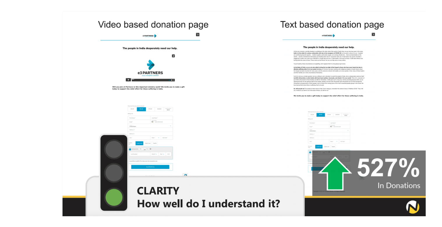
Our second A/B test shows a donation page led by a video vs. one that leads with text. The text version resulted in a 527% increase in donations!

The added value proposition through text resonated far better with potential donors.
The popularity of YouTube and TikTok has inspired many nonprofits to favor video over text. But there is a time and place to leverage video, and this donation page was not the right time or place.
Countless studies deem reading the superior transmitter of information to watching or listening. Reading sparks more clarity, plus a reader can read at their own pace rather than watch at the video’s pace.
Another thing to consider, especially with donation pages, is where visitors are coming from. If they’ve come from a text-heavy ad to get to your donation page, they probably prefer a seamless transition to more text instead of getting disrupted by a video. If they’ve come to your page from a video ad, they probably prefer not to watch another video. These are configurations that you can test!
A/B Test #3: Send Emails Like a Human Being
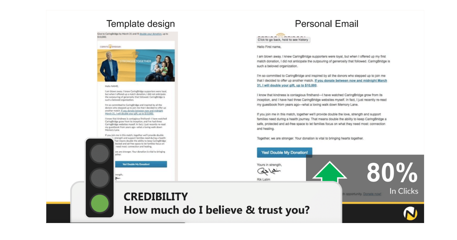
This experiment tests a template design email vs. a personal email. You can see that the personal email does not include a call-to-action at the top of the page or a banner, as the template design email does. The result: 80% more email recipients clicked within the personal email than the design email.
Why did the personal email get more clicks? Because the recipients felt like they were being talked to instead of marketed to.

Consider the way you send a personal email. When you email a friend, do you use a design template? Or do you open up your Gmail or Outlook and type away using the standard layout?
What about receiving an email? Do you get more excited when opening yet another marketing email or opening an email from someone who wants to make a connection with you?
A personal email builds trust and credibility; it creates a 1:1 perception rather than a 1 to many. Your audience is intelligent. They know the difference between a marketing email dispersed to thousands and an email with a personal interest.
When you communicate to a human being like a human being, your influence is stronger and more honest.
A/B Test #4: Give Actual Reasons for People to Subscribe
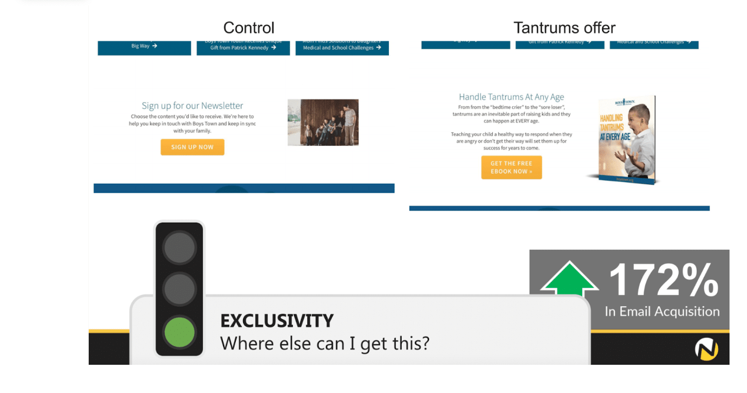
For our final A/B test, we look at two variants aiming to gain subscribers. The variant on the left features a standard newsletter sign-up request; the variant on the right features a specific eBook sign-up request. As you can see, the eBook offer acquired 172% more emails than the newsletter offer.

Exclusivity is the key element here. A person can visit just about any website and subscribe to an organisation’s communications. The opportunity is common.
However, not every website presents an exclusive eBook that someone can access for free. And the website displayed in the experiment is the ONLY place someone can access the “Handling Tantrums at Every Age” eBook.
This approach makes the offer special – and the visitor special.
Giving someone actual reasons to sign up is a tremendous use of value proposition. Just look at this excerpt from the eBook offer copy:
“Teaching your child a healthy way to respond when they are angry or don’t get their way will set them up for success for years to come.”
This value of “setting children up for success for years to come” speaks to every parent, and every parent can also relate to their child having a tantrum. The value and opportunity presented through the eBook and eBook value proposition copy is something a potential donor can’t get anywhere else – unlike a newsletter subscription.
If you want to discover new depths of leveraging your value proposition, get in touch with Marlin’s team of creative specialists. We’d love to help you develop a new messaging approach. For some inspiration, check out our value proposition work with The Smith Family.


