Five ways to reduce friction in your online donation experience
— Written by Dan Geaves, Creative Director of Marlin Communications
Whilst working as Director of Fundraising and Communications at the Australian charity ReachOut.com I was introduced to The Fogg Behavior Model.
It shows that three elements must converge at the same moment for a behavior to occur: Motivation; Ability; and a Prompt.
When a behaviour does not occur, at least one of those three elements is missing.
A great donor experience (offline and online) must combine all three of these elements. When something is missing – donors do not donate. And of course you can’t really describe that you are a fundraiser without donations. So alongside motivating or compelling creative messaging… alongside simple and clear prompts, calls to action and asks… fundraisers need to be obsessed with ability.
A great donor experience online combines the call to donate with content that drives motivation, and the most simplified means for the donor to take action.
It is important for all of us to get digital – which means taking the same rigour we have in other channels. Channels such as direct mail, telemarketing and face to face have thrived because of insights creating a discipline of continuous improvement.
If you look at the current benchmark for donation page conversion from the 2021 M+R Benchmark in the USA, the completion rate is 21%. Put another way, 79% of people who visit the main donation page with some interest in giving do not give.
Here are five actions you can take to reduce the psychological resistance that visitors to your website experience when trying to donate.
1. Address the donor’s perception of work by removing non-essential information requests (even if they seem simple).
As fundraisers we know that we want to contact our donors to thank them, and nurture them towards a second gift, regular giving and even gifts in wills.
But there is of course a trade off.
Experiments in the USA have shown that adding a mailing address as a mandatory field pre-donation can reduce completion of donation forms by 10%.
The more form fields you present and the more information you are collecting, the greater the chance that someone will abandon the giving process. Strip back what you are asking for.
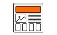
2. Change the design of your forms to avoid the perception that donating is a time-consuming task.
The way that forms are displayed and the way fields are grouped together and spaced can impact the perceived cost or effort required to complete an action.
So not only does the number of fields matter but so does the layout.
A good rule of thumb is to use horizontal layouts for desktop and then use responsive design for different devices.
In experiments conducted by Next After over in North America, layouts were tested in experiment conditions – true A/B testing. And the tests found that layout designs can increase conversion by as much as 39.4%. When horizontal layouts are used the completion rates soar because of the change to perception.
If it looks like it’s less work, donors are more likely to start and complete the form.
Grouping the form fields together and using horizontal spacing to reduce the perceived work required to complete the donation will significantly increase the chances of donors completing the giving process.
One of the ways you can manage perception of time is by using a three step method. And, by showing people that is what you are doing they can feel certain that they know how far they are through the act of donating, and how far they have to go.
A bonus of the three step approach is also that you can capture the early data – so if someone does not complete – you can reach out to them via email to encourage them to come back and finish what they started.
3. Check how your site reacts to incomplete fields in order to reduce interrupting the donor’s flow.
Have you ever filled in a form online… clicked submit, waited, waited wondered whether your internet had dropped out… only to then scroll all the way back to the top of the form and discover that the site is suggesting you have not completed your information properly?
I know when this happens to me i ask myself :
- Did I miss the asterisk telling me the information was mandatory?
- Why do they need that data?
I find myself intolerant of the interruption to me getting the job done.
With donation forms consider whether you are:
- Being clear about what fields are mandatory;
- Helping people by flagging the incomplete fields as soon as possible, not waiting for them to submit the whole form.
4. Remove menus and links that interfere with the completion of a donation.
Confusion friction refers to any unexpected items to include navigation bars, competing calls to action, distracting links, and messages that are not related to the giving experience.
Whilst working with Plan International Australia, Marlin designed their site to completely remove the main website menu once the donation page has been clicked on. Each prospective donor is provided the equivalent of blinkers in a horse to keep them focused on the path ahead.
From the donor’s perspective, they have already expressed interest in donating by coming to the donation page. Having a navigation bar or links to other pages could lead them away from completing the donation.
5. Review and improve your donation experience on mobiles.
Each of the areas for improvement identified above can be exacerbated on a smaller screen.
In the US benchmarking has revealed that 25% of donations are now made using mobile devices. It is important to test your page to check it is functional on mobile.
There should be no need for pinching or zooming.
Mobile or digital wallets only account for 18% of all transactions and payments in Australia.. But that is expected to rise. Something to keep an eye on is how you introduce this to your audience… because it will have the potential to reduce friction enormously for those who use it. It is very early days here in Australia.
Final thought
It is best practise to measure your visitor numbers, site conversion, and completion rates.
Digital is an enabler for you as well as your donors…. and part of that is its ability to enable you to create tests and comparisons of your own. When you have addressed this list of five, you can start experimenting with more donor experience enhancements, to discover ways to improve the rates of donation page completion, and raise more money online for your cause.
Putting this in place is precisely why Marlin developed the Marlin Web Platform, to help more charities like yours to be able to affordably put these best practise donation experiences into practise. We offer free, “take a look” sessions which we refer to as demos. If you would like to book one you can do so right now by visiting here.