

8 ways to improve your donation page
— Written by Nathan Hill, with an intro by Marlin
With the help of NextAfter, we’ve become testing and optimisation converts. To do so requires a concerted effort to test various elements across your organisation’s website. Check out Nathan’s blog post, featuring 8 ways you can improve your donation page to learn more about your donors and increase your online revenue. You can find the original article published here.
1. Use YOU. Focus on the role of the donor, not the role of the charity.
Do you have a clear value proposition on your donation page? In other words, do you clearly articulate why someone should give?
Organisations often assume that their donation page visitors are mentally committed to donating, fully educated on your cause, and informed of how their donation will make an impact.
This experiment, however, proves that using copy to articulate why donors should give to your organisation has a huge impact on someone’s likelihood to donate.
Reminding the visitor WHY they should donate using multiple paragraphs of copy increased donor conversions by 150% in this experiment.
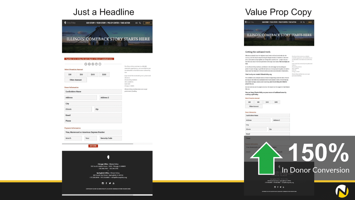
Key Takeaway: The addition of the value proposition can increase donations, so ensure your donation page clearly states WHY your visitor should make a donation.
2. Call out a “Most Popular” donation amount in your gift array.
It’s common practice to highlight a recommended gift amount in a donation page gift array. But this organisation wondered if they could take it a step further using social proof language.
In this experiment, the organisation added a “Most Popular” call-out on their default donation amount.
By highlighting a pre-selected donation amount ($50) as the “most popular” gift amount, revenue increased by 94%. The average gift also increased by $11.06.
Eliminating the potential for uncertainty and highlighting the most popular donation amount creates social proof and may encourage donors to give even more. This was particularly effective for visitors on a mobile device.
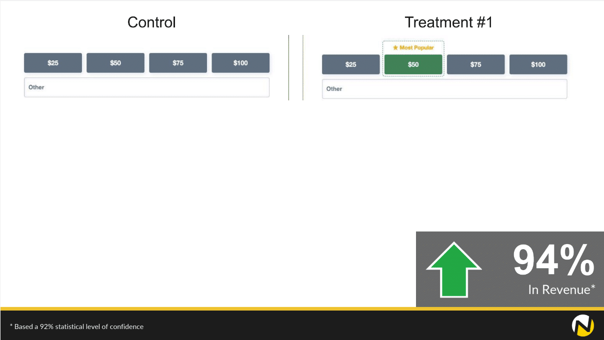
Key Takeaway: Test calling out a “Most Popular” gift option to make it abundantly clear how much of a donation is valuable.
3. Make your recurring gift option abundantly clear.
Recurring donors are far more valuable (and retain at a much greater rate) than single-gift donors. But the presentation of your recurring gift option can impact how many people enroll.
On the original donation page, the form had an icon labeled “Make it recurring” that would expand the recurring gift details. But this organisation wondered if simplifying the process to a checkbox and clearly articulating the benefits of a recurring gift would lead to more conversions.
The simplified checkbox led to a 70% increase in recurring donations and the overall conversion rate started the same. This means they saw just as many donations, with more of those donors becoming recurring donors.
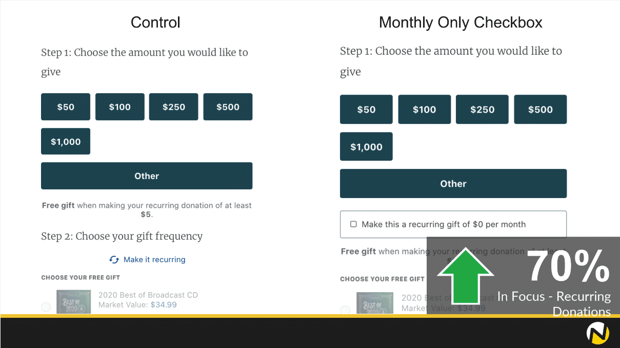
Key Takeaway: Test clarifying your recurring gift option (as well as the benefits) within your donation form.
4. Take that distracting video off your donation page.
Videos are incredibly powerful tools. They can tell stories in ways you can’t with your copy. They can evoke powerful emotions in your viewers. And, as if by magic, they can obliterate your donation page conversion rate.
Nearly every experiment in our online fundraising research library that uses video on a donation page leads to a decrease in donations.
In the best of cases, it makes no difference whatsoever.
And in one experiment, this organization saw that removing the video on their donation page led to a 527% increase in donations.
But these experiments aren’t just about videos VS no videos. In the experiment below, you can see the video was replaced with copy. The copy outlined the same core message and value proposition as the video — it just used a different medium.
By using copy to communicate your message rather than a video, you’ll have a far better shot at leading visitors towards a donation.
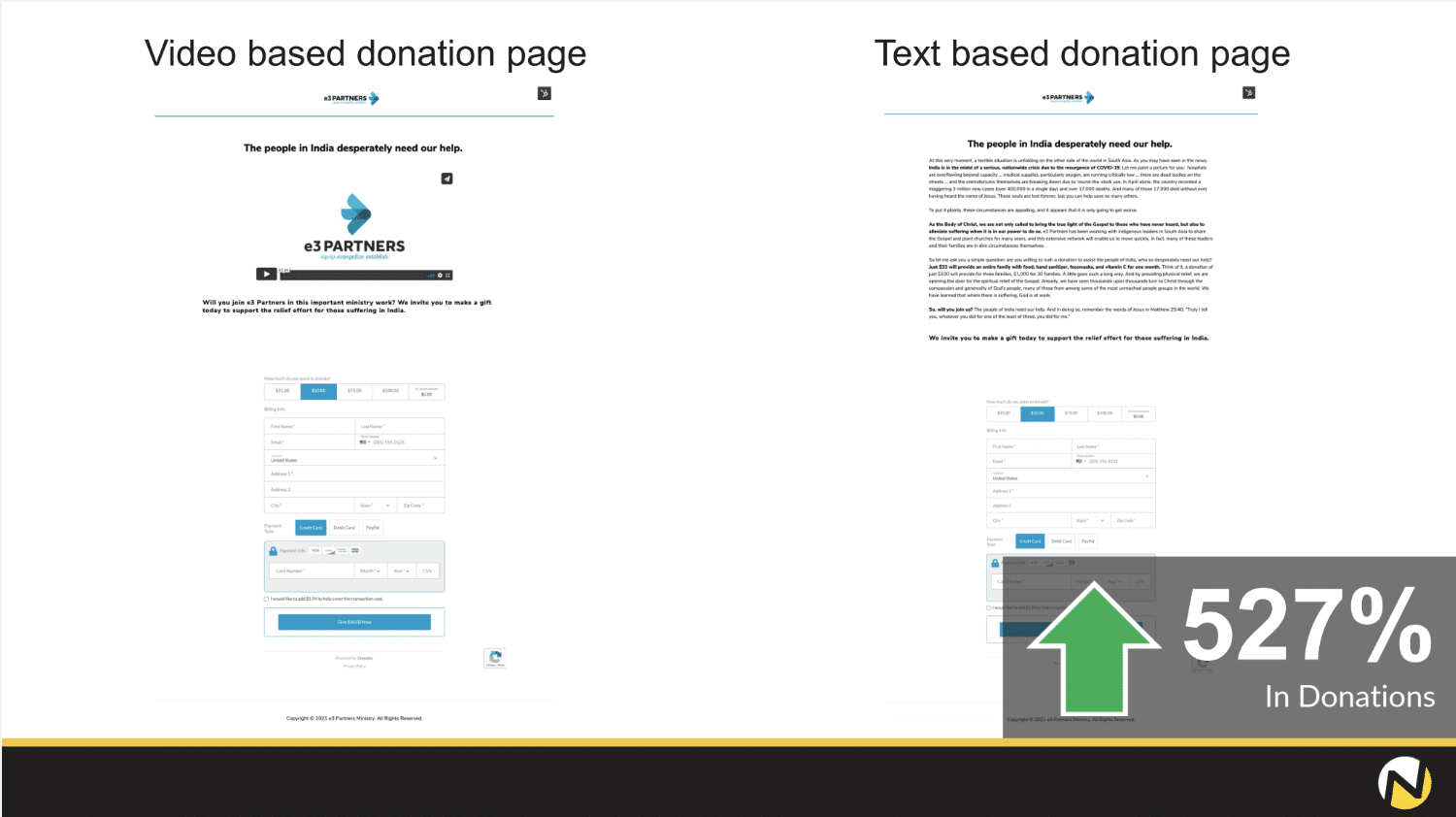
Key Takeaway: Test removing videos from your donation page, and replacing them with copy that communicates the same value proposition.
5. Let your donor know they are part of a community of people who care.
How you communicate with your potential and existing donors can have a lasting impact on your audiences.
Let’s take a look at how the difference in language on a donation page can impact donations.
In this experiment, the organisation tested the use of more communal language, adopting a conversational and welcoming tone and highlighting the importance of the reader. The original donation page used copy that was more organisation-centric.
What did the experiment tell us?
The organisation saw a 56% increase in conversions when using more communal language, which reveals the importance of adopting a conversational tone to relate to your audience.
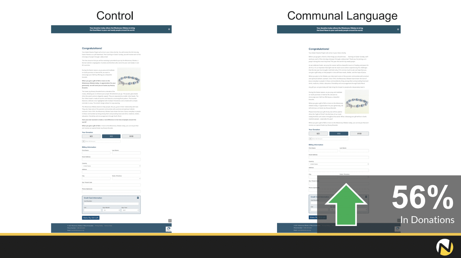
Key Takeaway: Test using copy and messaging that is more warm, personal, friendly, and inviting to help donors feel a greater sense of belonging — and lead to more donations.
6. Delete distractions. Get from ‘Hi to thank you’ in as few steps as possible.
It’s easy to overcomplicate processes, especially when it comes to your donation page.
It’s crucial when it comes to filling out a donation form to make the process as simple as possible. Too much donation page friction will cause donors to leave.
This experiment is a great example of how reducing friction can increase giving. This organization ran an a/b test to see if they could increase donations by removing unnecessary steps including:
A comment field
An option to cover the credit card processing fee
An option to give a gift on behalf of someone
The donation form that removed unnecessary steps and reduced friction led to a 107% increase in donations.
As you set up your page, ask yourself; is that field really necessary? If the field isn’t necessary to complete the transaction, then you probably don’t need it.
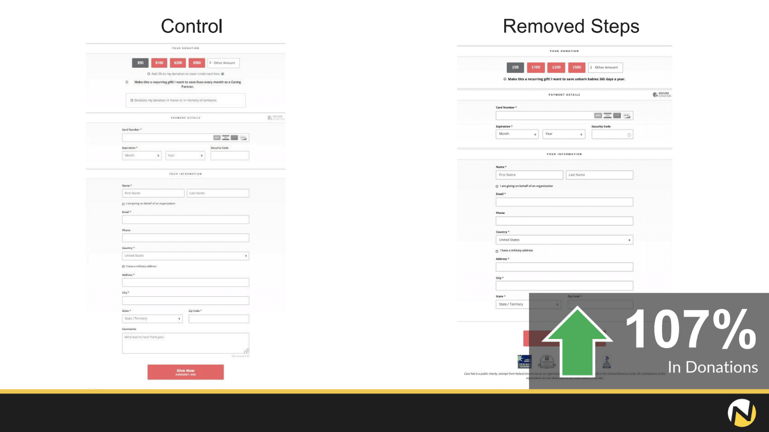
Key Takeaway: Test removing unnecessary form fields. They may be adding friction to the giving process and creating confusion.
7. Use first-name personalisation whenever possible.
There’s power in calling someone by the name. And if your donor has already told you their name, it can be incredibly valuable to personalise their donation page.
In the experiment below, the donation page visitor had just filled out a form to sign up for a weekly newsletter. And instead of a traditional “Thank you” page, they landed on an instant donation page.
This page said “Thank you, friend” for signing up for the newsletter. And then immediately pivoted towards donation ask in hopes of acquiring an “instant” new donor.
This organisation wondered if adding the first name of their new subscriber into the headline of the “instant donation page” would impact donations. And after running an a/b test, they saw an 83% increase in donations by calling their would-be donor by name.
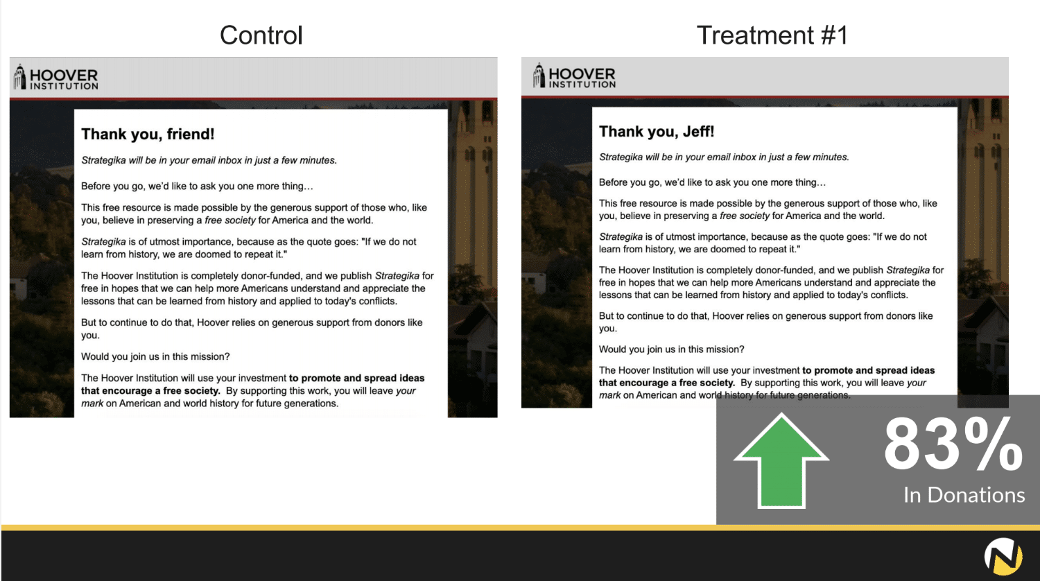
Key Takeaway: Test using first-name personalisation on your donation page wherever you can. It could make all the difference in helping your visitor complete their donation.
8. Reassure donors when they’re about to click the “submit” button.
The most underutilised space on your donation page is right below the final “donate” button — or maybe yours says “submit.”
But this point on your donation page is the point of no return. Every would-be donor is going to pause at this button and consider their donation. Once they click the button, there is no turning back.
At this point, donors may be wondering:
Can I really give this much?
Do I trust that my gift is going to make an impact?
Do I trust this organisation to keep my information secure?
In the experiment below, one organisation wondered if they could use the space below the button to address some of these points of concern and anxiety. They used a simple sentence to reinforce the value proposition below the button.
The result was a 42% increase in donations by reminding donors of the value of giving right below the button.
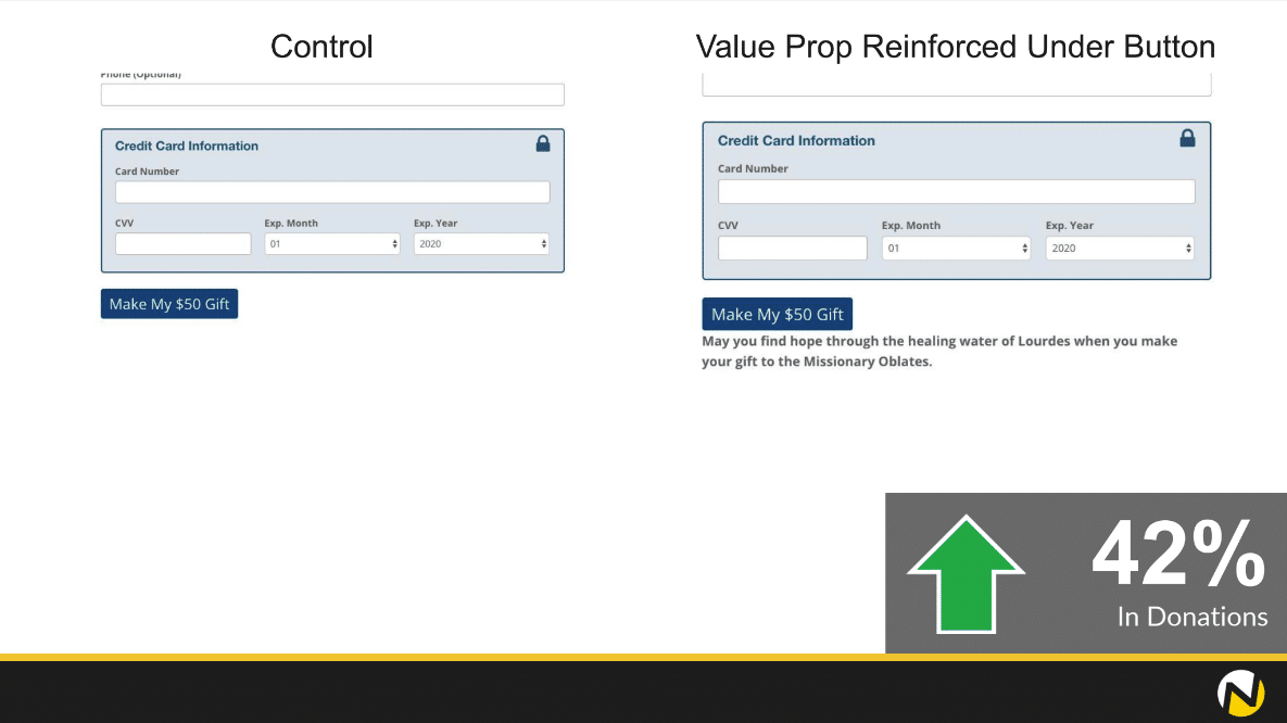
Key Takeaway: Test using the space below your final donate button to remind your prospective donor how their donation will make an impact.
The Importance of A/B Testing To Optimize Your Donation Page
There is so much to be learned from testing. Whether it’s optimising a small amount of copy or revising an entire donation page, these small changes can have a huge impact on your donations and revenue.
And that’s not just the case for donation pages! You can experiment with variants in email copy, formatting, subject lines, and sending times.
This comprehensive guide on A/B testing for non-profits is a great place to start if you’re new to testing and just need some help getting started.