

How an icon and a grey box increased donations by 11.5%
— Written by Tim Brack
Over the past 12 months, we’ve been drastically ramping up the volume of a/b testing that we’re deploying in digital fundraising campaigns.
We’ve been testing all sorts of things including:
- Email appeal messaging
- Email marketing and fundraising design
- Donation page layouts
- Ad images, copy, & calls-to-action
- And a whole lot more
One of the most important learnings along the way is that the little things matter.
Growing digital fundraising results is not always about trying the next big, grand, and innovative ideas. In fact, many winning results are small changes that demonstrate greater empathy for the donor.
The Experiment
In this donation page experiment, we wondered if some potential donors were abandoning the giving process because of concerns about the security of the donation.
Don’t get me wrong… the donation page was a secure page, and there was nothing particularly concerning about the donation form itself. But anxiety about giving does not live on the page—it lives in the mind of the donor.
Previous research from NextAfter, our partner agency in the US, has shown that many donors experience anxiety about the security of the donation when asked to put in their payment information. High-profile data breaches in recent years may also be on peoples’ minds.
We developed a hypothesis:
Wrapping the payment information in a grey box, adding a padlock icon to the text, and another near the submit button will increase donations by alleviating the potential donor’s anxiety about the security of their donation.
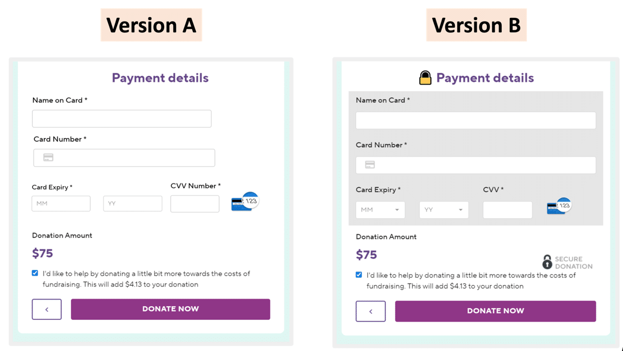
Version A, the control, used the normal giving form design and layout.
Version B, the treatment, kept everything about the form the same, but added a grey box and a padlock icon.
The Result
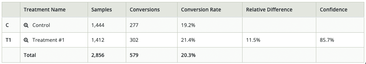
Adding a grey box and padlock icons increased donations by 11.5% at an 85% level of confidence.
Digging into the data, the treatment had the biggest impact for desktop users, lifting donations by 22% at a 93% level of confidence.
With high confidence levels and such a significant jump in conversions, we plan to roll this out on the donation form going forward, and to investigate methods for boosting mobile performance.
Overall Results
The Learning
Our friends at NextAfter have consistently seen this tactic increase donations by 10-20% almost every time it’s been tested.
Seeing this same result with a local organisation is a great reminder that many optimisation principles are universal.
Regardless of if your donor lives in Australia, Aotearoa, or anywhere else in the world, anxiety about the security of a transaction is a universal feeling. Addressing anxiety right away with your design can meaningfully move the needle on donor conversion.
How do you run this experiment yourself?
- Sign up for an a/b testing tool like Convert.com, VWO, or other a/b testing tool.
- Search an image library for a “padlock icon” and find yourself a good-looking PNG padlock – a paid account on The Noun Project will give you access to heaps of options.
- Drop the padlock by your payment information on the donation form.
- Change the background colour of your payment information to grey (this may take a little CSS knowledge)
- Double check how it looks on mobile and desktop
- Launch your experiment for at least a week, and no more than 30 days. (You’ll adjust your time depending on your traffic volume and existing conversion rates)
- Check your results 👍
Not sure how to get started? Not enough time to get started?
We’re happy to help! Get in touch with us over at Marlin and let us know you’d like to start a/b testing. We’d be happy to help you start optimising your digital fundraising.